- The CSS styles declared in this file will be applied when the viewing screen is larger than 1000 pixels wide.
- The preview will change as the visitor changes the browser window (on a desktop computer), as well.
- Create a new CSS file (File > New > CSS) and add this code to the file:
- Save file as "desktop_styles.css" in the "css" folder.
desktop_styles.css
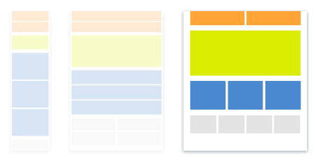
All CSS defined in the "desktop_styles.css" file will affect the preview of the desktop viewing of this website only.The code will detect what size screen the vistor is viewing the website on and change the styling accordingly.
@media screen and (min-width: 1000px){
/*All this CSS is Different than Mobile CSS*/
html, body {
margin-bottom: 80px;
margin-top: 0px;
background-color: #B8B8B8;
height: 100%;
}

#frame {
width: 1010px;
height: 100%;
min-height: 100%;
margin-top: 0px;
margin-right: auto;
margin-left: auto;
background-color: #FFFFFF;
height: 800px;
padding: 0px;
border-left: 5px solid #000000;
border-right: 5px solid #000000;
}

header {
width: 100%;
height: 150px;
background: #fff;
}

#header_logo {
float: left;
padding: 40px;
}


#intro {
float: left;
color: #000000;
padding-left: 40px;
padding-top: 20px;
padding-right: 40px;
padding-bottom: 20px;
font-size: 1.2em;
overflow: visible;
margin-bottom: 0px;
border-bottom: 5px solid #000000;
}

#stage {
float: left;
padding-left: 40px;
padding-top:0px;
margin:0px;
width: 100%;
}


#col_1, #col_2{
width: 280px;
float: left;
margin-right: 40px;
padding:0px;
}

#col_3{
width: 280px;
float: left;
padding:0px;
}

#gallery{
width: 600px;
float: left;
}


#col_1 img, #col_2 img, #col_3 img {
width: 280px; height: 280px;
}

#gallery img{
width: 30%;
height: 30%;
cursor: auto;
pointer-events: auto;
}


img {
max-width: 900px;
max-height: 500px;
}

nav{
height: 38px;
width: 1010px;
float:left;
border-bottom: 5px solid #000000;
padding: 0px;
}


nav li {
display:inline-block;
margin-left: 40px;
padding-left: 0px;
float:left;
width: 280px;
}


nav li a {
font-family: 'Roboto', Arial, sans-serif;
font-size: 1.2em;
color:#FFFDFD;
background-color: #9F9F9F;
text-decoration:none;
padding-bottom: 0px;
margin-bottom:0px;
width: 270px;
padding-left: 5px;
padding-top: 10px;
display:block;
}


nav li a:hover{
background-color:#373232;
}

#footer img{
width: 60px;
height: 60px;
}

#menu-icon {
display: hidden;
}

}