- The CSS styles declared in this file will be applied when the viewing screen is less than 680 pixels wide.
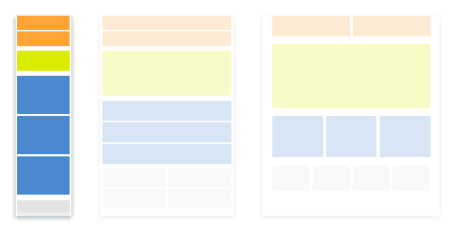
- Navigation will change to icon menu.
- Image sizes will be the full width of the screen and stacked (no grid).
- Create a new CSS file (File > New > CSS) and add this code to the file:
- Save file as "mobile_styles.css" in the "css" folder.
mobile_styles.css
All CSS defined in the "mobile_styles.css" file will affect the preview of the table (or smaller desktop viewing of this website only).The code will detect what size screen the vistor is viewing the website on and change the styling accordingly.
@media screen and (max-width: 679px){
/*All this CSS is Different than Desktop CSS*/
html, body {
margin-bottom: 80px;
margin-left: 0px;
	margin-right: 0px;
}

#frame {
width: 100%;
position:relative;
top: 120px;
left: 0;
z-index:50;

}

header {
width: 100%;
margin-bottom: 40px;
position: fixed;
height: 70px;
top: 0;
left: 0;
padding: 10px;
background: #FFFFFF;
z-index: 100;
margin-bottom: 10px;
box-shadow: 2px 2px 5px #888888;
border-bottom: 5px solid #000000;
}

#header_logo {
float: left;
padding: 10px;
}

header img{
width: 80%;
height:auto;
}

#intro {
float: left;
color: #000000;
padding-left: 5%;
padding-top: 0px;
padding-right: 5%;
padding-bottom: 5%;
font-size: 1.2em;
overflow: visible;
margin-bottom: 0px;
border-bottom: 5px solid #000000;
}

#stage {
float: left;
padding-left: 0px;
padding-top:0px;
margin:0px;
width: 100%;
}

#col_1, #col_2, #col_3, #gallery{
width: 100%;
float: left;
	border-bottom: 5px solid #000000;
}

#col_1, #col_2, #col_3, #gallery p{
width: 100%;
float: left;
padding-left:20px;
}

	#col_1 img, #col_2 img, #col_3 img{
width: 90%;
}

#gallery img{
width: 100%;
height: 100%;
padding-bottom: 10px;
padding-right: 10px;
pointer-events: none;
cursor: default;
}


#footer {
position: fixed;
text-align:center;
left: 0px;
bottom: 0px;
z-index: 1;
height: 60px;
background-color:#E6E5E5;
width: 100%;
padding: 10px;
float: left;
font-size: .8em;
box-shadow: 2px -2px 5px #888888;
}

#footer img{
width: 40px;
height: 40px;
}

nav{
position: absolute;
right: 30px;
top: 10px;
width: 100%;
}

#menu-icon {
display: inline-block;
display: visible;
position: absolute;
right: 0px;
top: 0px;
width: 40px;
height: 40px;
background-color:#BEBCBC;
background-image: url(../images/menu-icon.png);
}

a:hover#menu-icon {
background-color: #444;
border-radius: 4px 4px 0 0;
}

nav ul, nav:active ul, nav:hover ul{
display: none;
position: absolute;
right: 0px;
top: 30px;
padding: 10px;
background-color: #FFFFFF;
border: 5px solid #444;
width: 30%;
}

nav li {
font-family: 'Roboto', Arial, sans-serif;
font-size: 1em;
height: 40px;
text-decoration:none;
text-align: right;
width: 100%;
padding-right: 10px;
margin: 0;
}

nav li a {
text-decoration:none;
color:black;
padding: 5px;
}

nav li a:hover {
text-decoration:none;
color: white;
background-color: #707070;
}

nav:hover ul {
display: block;
}


}